Article by Tudor Belivacă – Published Tuesday, 05 May 2026, 10:00 / Updated Tuesday, 05 May 2026 10:00
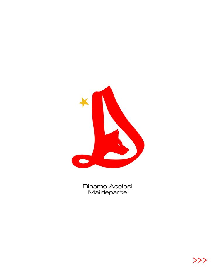
During May 4, Dinamo presented its new logo, which will come into use from July 1. Fans reacted negatively to the club's announcement, and just hours after the decision, taking advantage of access to technology and artificial intelligence, supporters of the “dogs” created several emblems that they consider better than the one presented by the management with great pomp on the club's social media pages.
The groups of ultras, the fans, the pages dedicated to the supporters, but also the legends reacted in unison after the change of the visual identity of the club. Dissatisfaction is high, and the “dogs” force to reverse the decision. Several fan-made emblems have started circulating on social media.
Dynamo supporters came up with variants of coats of arms after the decision to change the club's coat of arms: “
The fans came up with several reinterpretations of the version presented by the club from Ștefan cel Mare and tried to use the “D” as a base, but also the two dogs that are on the chest of the Dynamo players from 1998.
-
“I made a better one in two minutes. Contact me if you want, I'll make you another 10. Don't leave this D because it's under any criticism”
-
“It worked out better for me”
-
“Did you also use ChatGPT?”
-
“Even ChatGPT makes them better than you”
-
“ChatGPT moves better,” were some of the fan reactions.
Dynamoist glories are outraged! Dinu and Prunea went on to insults: “Dude, she's really ugly! She's made in the image and likeness of Nicolescu”
“He didn't tell anyone why he was invited to this event. It seems to me that it's all done in secret. This bothers me, apart from the change of the logo, which is stupid. Well, it's ugly, forgive me, for real if not. You say it's made in Nicolescu's face and likeness, on my word of honor. Well, does it look like him? Well, look carefully and I'll You see. I was shocked. This is my word of honor. They called me to have a position. Guys, I didn't know what it was about,” said Florin for Dinamo.
It is a shame made by some Venetians. Whoever did this is an imbecile or imbeciles, maybe there are more. Any club is identified by its origin and the origin must not be changed no matter what it is.
Dinamo's origin is not a shame, on the contrary. But to show up with something like that… it's kind of a snotty comma. Comma combination with snot. Nicolescu's thinking.
-Cornel Dinu, legend at Dinamo
-
The red and whites have had 7 logos in their 77-year history, the most glorious being the one from 1974-1990, when Dinamo had become a force at European level;
-
The current logo, with the “dogs”, was in force since 2004, and Dynamo won a single championship with it on their chest, two Romanian Cups, two Super Cups and a League Cup.

Dynamo logo
-
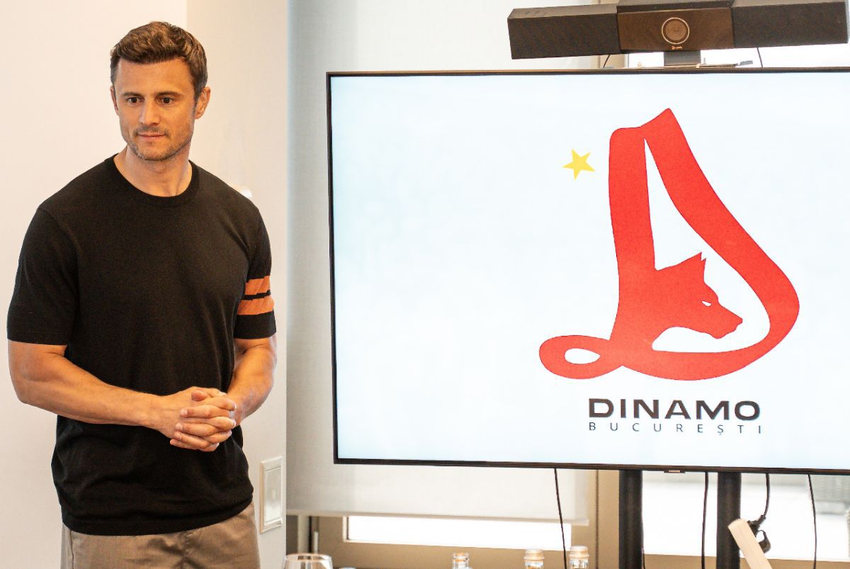
Andrei Nicolescu conveyed that he expected negative reactions following the change prepared by the club and claims that the decision was taken after a careful consultation: “Journalists, legends, Dinamo fans, those on the lawn, shareholders, people from the club participated in this process, they all participated in the process of creating and identifying this logo”