The artificial intelligence proposed 3 logos for Dinamo, on the instructions of Gigi Becali » What came out: “It only brought them bad luck!”
Article by Sebastian Vasile – Published Tuesday, 05 May 2026, 12:31 / Updated Tuesday, 05 May 2026 12:38
On May 14, 2024, the day Dinamo Bucharest celebrated its 76th anniversary, Gigi Becali urged the red and whites to change the club's logo, which he believes has brought them “only bad luck”. Given that two years later, the new Dynamo logo was met with a wave of criticism, ChatGPT and Gemini have now put together the directions given then by the FCSB boss.
Two years ago, on the day Dinamo celebrated its 76th anniversary, Gigi Becali was asked if he had any advice for the local rival.
“Well, until they change that logo… That they didn't have a bad team, but until they change that logo… Put a lion, a bear, change that head, from a dog to a bear. But if you leave a dog or wolf logo… Hell, that's what it means!
Change the logo, that must be changed! They are just unlucky”, was the answer of Becali, who insisted that he was serious.
two years later, Dinamo even presented a new logowhich he will use from July 1. The new “shield” was received with a wave of criticism.
The AI presents 3 variants of logos for Dinamo, on the instructions of Gigi Becali
In this context, we challenged two artificial intelligence assistants, ChatGPT from OpenAI and Gemini from Google, to propose variants of logos for Dinamo, but made according to Gigi Becali's instructions.
For starters, ChatGPT creations:
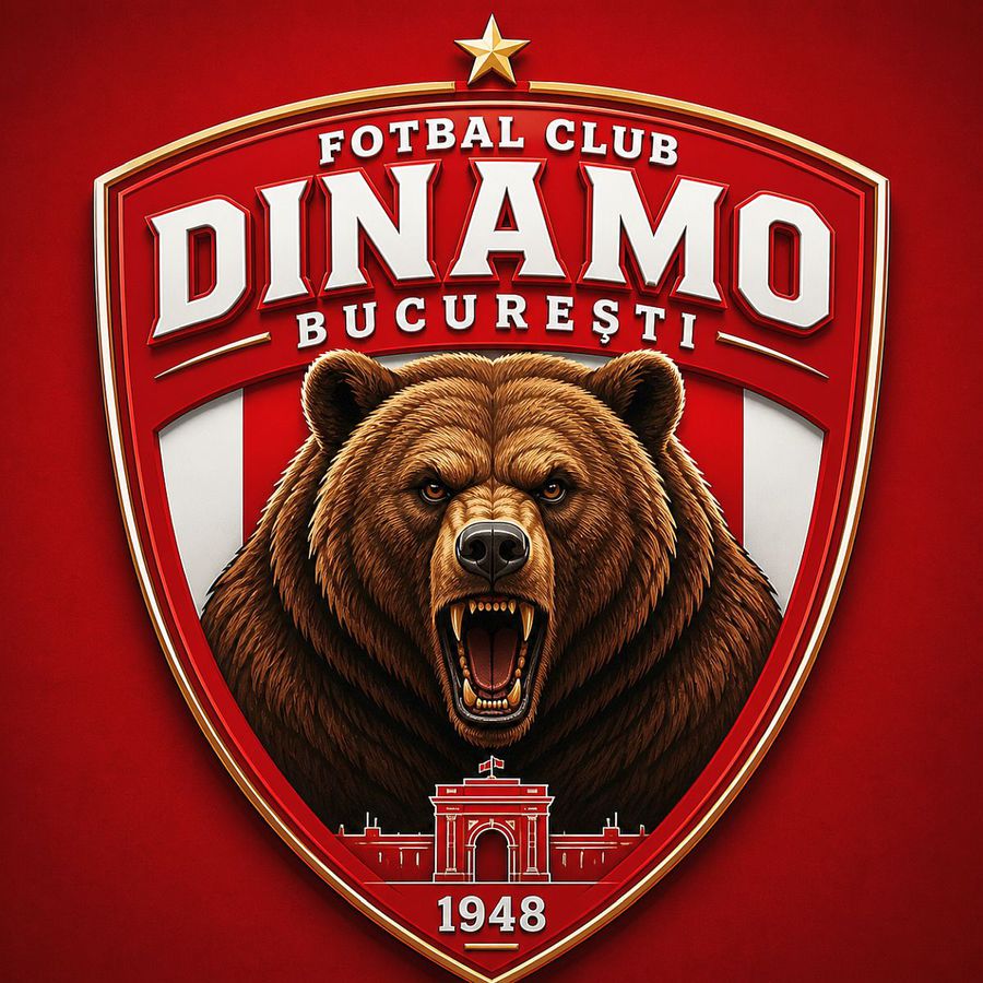
Some explanations for these creations:
Gigi Becali insisted on the idea of a bear (“from a lion make a bear”), so the bear appears as a dominant, aggressive figure with its mouth open — a symbol of brute force and intimidation.
In the first version, I also kept a lion next to the bear, so that it would not be too sudden a change and to preserve something from the classical heraldic language (the lion is widely used in sports logos). Basically, it is a “bridge” between the old and the new.
Now, the Gemini interpretation:
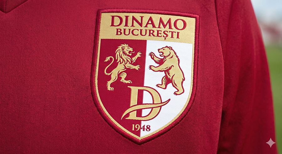
We kept the classic shield, divided vertically into red and white. It is the element that makes the logo instantly recognizable as Dinamo's, even from a distance. We kept the stylized 'D' at the bottom to visually anchor the design in the club's tradition.
The lion and bear are rendered in gold (the “value” color) to stand out against the red and white background. The bear was given a robust, mountainous profile, and the lion a heraldic posture, suggesting authority.
We presented the logo as an embroidered badge on the material of the t-shirt. In Gigi Becali's vision, things must be tangible, “luxury”, to see the stitching and quality, not just a flat drawing on the screen.
– Gemini's explanations for the proposed logo
Photo gallery | Dinamo's new logo