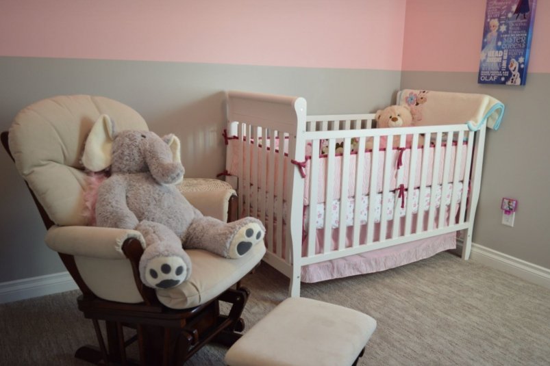
Decorating a children's room is not only an aesthetic task. The color scheme directly affects the psycho-emotional state, quality of sleep and ability to concentrate in a child.
Psychologists and color therapists caution against using saturated, pure colors, especially red and blue, as dominant colors.
- In a room with red walls or large furniture, it is extremely difficult for a child to relax and go into rest mode. This leads to difficulty falling asleep, shallow sleep and increased irritability.
- In excess, cold blue color can have a suppressive, “cooling” effect, reducing physical and mental activity. Apathy and slow reactions may occur.
A direct combination of these two antagonistic colors (for example, red-blue stripes or contrasting zones) is considered especially disharmonious, which creates internal conflict and increases stress levels.
Principles of a harmonious color palette for children's rooms
The key task is to create an environment that supports calm development, a sense of security and comfort.
For this, designers and psychologists recommend:
- The base background is soft, neutral tones. Pastel shades are ideal: warm beige, peach, mint, light gray, vanilla, soft lavender or olive. They are visually soothing and do not overload the perception.
- Bright colors are only used as accents. Cheerful yellow, juicy green or orange can and should be used in measured quantities: in toys, textiles (pillows, blankets), posters or on one small wall (accent). This stimulates interest without disturbing the overall balance.
- Age accounting. The younger the child (especially preschool age), the calmer and softer the color environment should be. As you grow older, you can add more saturated, but not flashy, shades.
Practical recommendations
- Test shades. Before painting, apply a test stroke to the wall and observe how the color looks in different lighting (day and evening).
- Zone with color. Use calmer tones in the sleep and relaxation area, and slightly more active ones in the play or study area.
- Focus on the child's temperament. For an active, easily excitable child, the palette should be especially restrained. For a calmer tone, slightly richer, but not aggressive, accents are acceptable.
Color in a nursery is a powerful tool that can either support or disrupt a child’s emotional balance.
Abandoning pure, intense reds and blues in favor of complex, muted shades is not a limitation, but a conscious step towards creating a space that promotes harmonious development, sound sleep and healthy concentration.
Important: This information is not a substitute for consulting a doctor. The body's response to changes in diet/training may depend on individual physiology, genetic predisposition and health status. It is recommended to consult a specialist.