In the field of interior design, the colors for which we opt in renovating or changing a space are an important topic and can bring many challenges regarding the decisions we make in the long term.
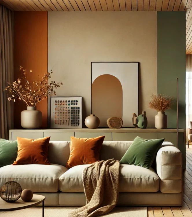
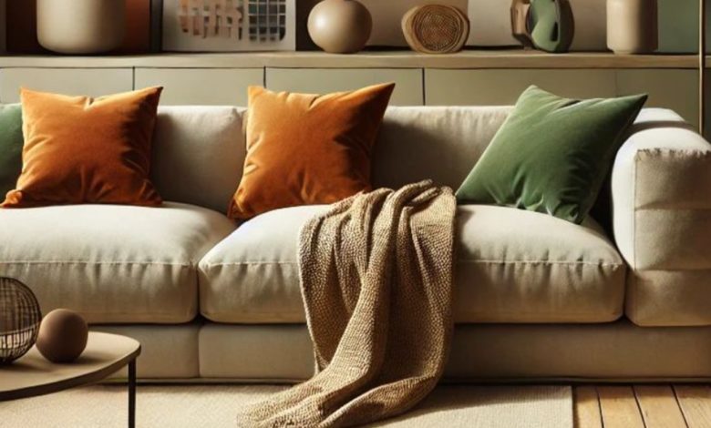
Specialists recommend neutral and warm colors for interior arrangement. Pinterest photo
Choosing colors for the interior of the house is essential to create a pleasant and balanced atmosphere. “In addition, the colors and places where we use can contribute to improving the mood, increasing productivity or inducing the state of calm and favoring rest ”, emphasizes Alexa Rădulescu Owner Infinity for Home. According to her, some colors, although they may seem attractive at first sight or in other contexts, such as clothing choices, can become tiring or difficult to integrate as a whole.
What colors is good to avoid
We present in the following a list of recommendations for both shades that should be avoided or used in moderation, as well as the most suitable and easily adaptable in any space.
1. The very intense and saturated colors
Colors such as bright red, intense orange or neon yellow can become overwhelming when used on large areas. Although these colors can bring energy into a space, they can create, in the long term, a sense of agitation and discomfort. It is advisable to use them only in small accents, such as decorative pillows or paintings.
2. The shades too closed in small spaces
Colors like black, dark purple or dark brown can make a space look smaller and darker. These colors absorb light and create a sensation of claustrophobia, especially in rooms that do not benefit from sufficient natural light. They can be suitable for delimited accents or areas, but not for the entire room.
3. The strong contrasting colors
The combination of strong colors, such as bright green with red, can be difficult to bear in the long run. These combinations create a sensation of visual chaos and are difficult to balance with the furniture and decorations in the rest of the house. To avoid this discomfort, try to avoid the colors in the opposite parts of the color spectrum.
4. The very cold and sterile colors
Tones of metallic or cold gray can give the feeling of distance and lack of comfort, especially if used on extended surfaces. These shades can make a room seem sterile and non -primers. If you want a warm and comfortable atmosphere, these colors are not the most suitable.
The right colors for a welcoming and always fashionable house
To create a space that is always pleasant, restful and comfortable, the most recommended colors are the neutral and natural ones. Here are some options that will not be outdated and you will not get bored to see:
White and cream – It offers brightness and a clean base, being easy to match with other decorative elements.
The hot shades of beige or light gray – creates a quiet and relaxing atmosphere.
Tones of sage green or mint green – I bring nature into the house, inducing a state of calm and freshness.
Pastel shades of pale pink, blue or lavender – offers subtlety and elegance without overwhelming the space.
These colors are ideal for having a quiet, welcoming and comfortable home, and their flexibility causes the decor to be easily adapted, without never bored.